About
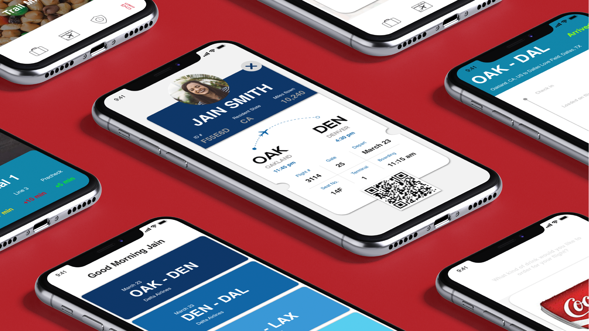
Flybye is an all-in-one airport assistant in your pocket. Whether you’re stuck in security, in the bathroom, or you’re at the wrong gate, Flybye is here to help you catch your flight. By simply accessing the app on your phone, you have the ability to never miss your flight or arrive to the wrong gate again.
My Role
My role was to research common pain points people were having at the airport. From that research, I synthesized and grouped all my findings to find and solve the most common problems people were having. After the research, I conceptulized, developed and tested the branding, wireframes, lo-fidelity/high-fidelity mockups and prototypes.
Mission Statement
When I was flying home to Los Angeles, I arrived two hours before my flight. I decided to go early so I could work on some homework that I had to do for the upcoming week. When I arrived at the airport, I went to check the flight information display board to see where my gate was. I misread the flight information and I ended up waiting at the wrong gate on the complete opposite side of the airport. Twenty minutes before my flight took off, my brother texted me asking when I arrived which made me realize that I was at the wrong gate. After almost missing my flight, I knew I wanted to create an application that allows users to never have this problem again.
Unvalidated Problem
Before I conducted research, I thought a majority of travelers miss their flights for multiple reasons, but often because they don’t know when to leave home, and they end up stuck in a long security line or stuck in traffic.
Validated Problem
After conducting interviews with several experts in the air transportation industry, as well as passengers, I have concluded that the most common reason passengers miss their flight is because they get their flight information mixed up or passengers show up after their flight departs.
Persona
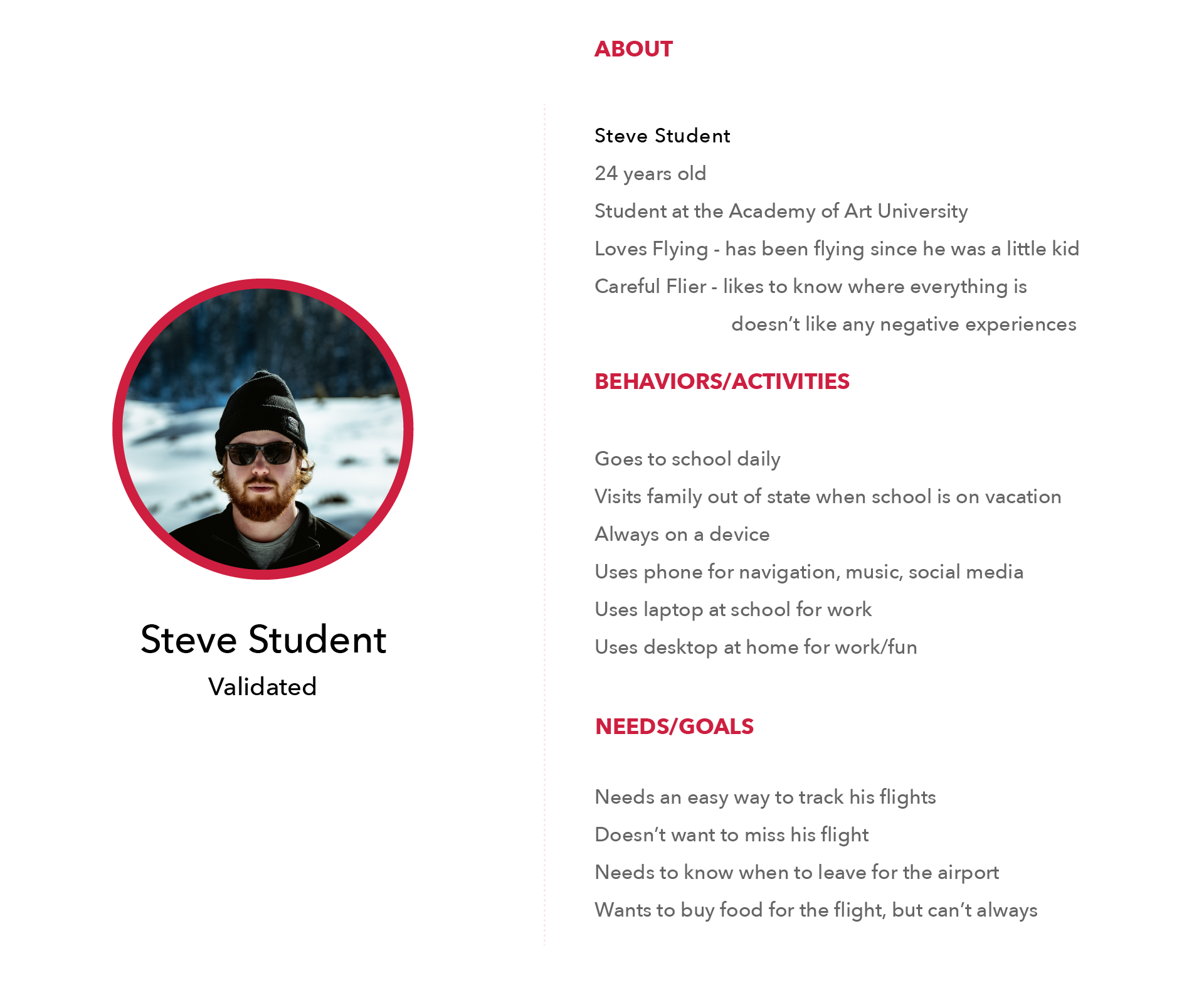
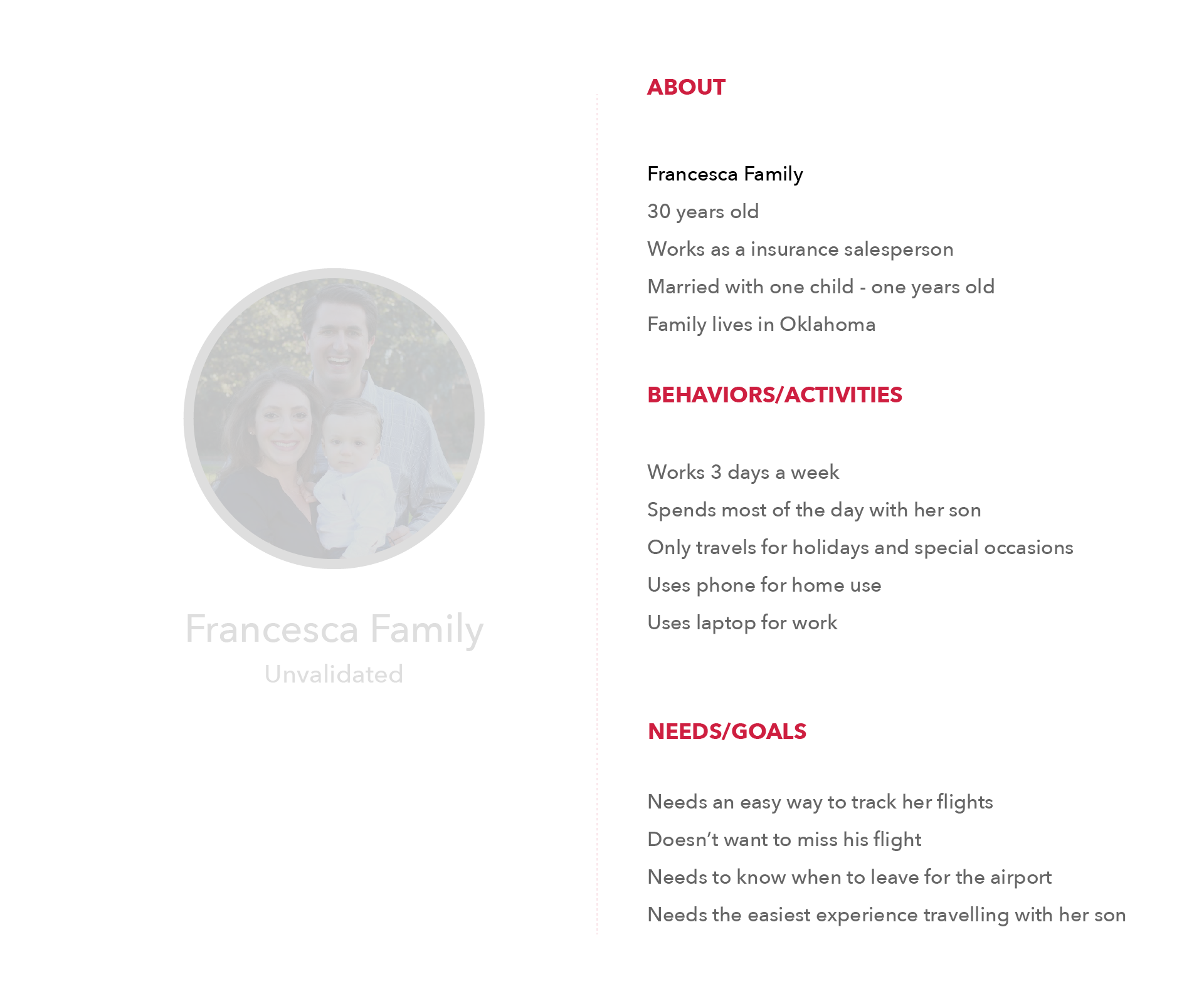
After doing some basic research online, I found two possible personas; single passengers and family passengers. After talking to several different experts, I concluded that single passengers travel more consistently while family travel is more seasonal.
Research
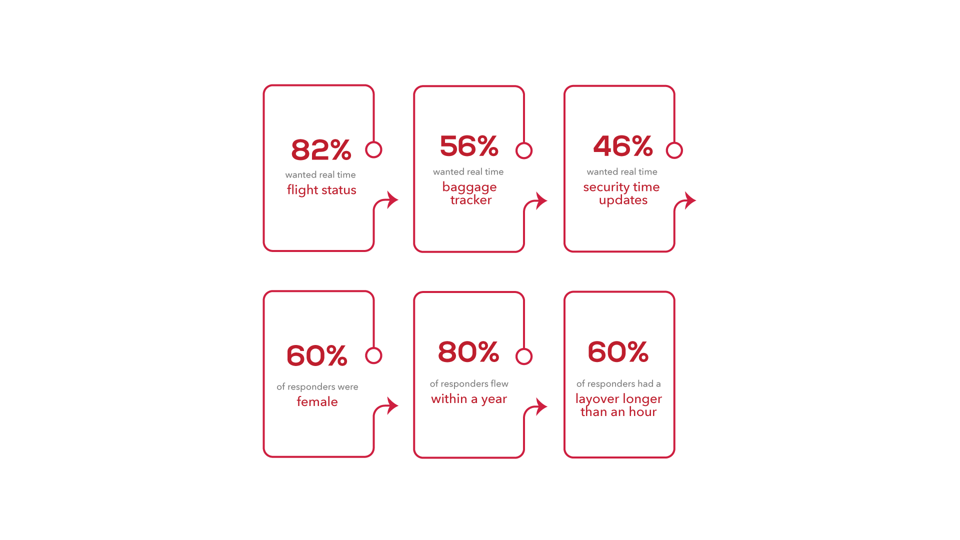
When I first got the details of the project, I wanted to figure out a way to create a communication system between passengers and gate crew. But after talking to Senior VP of American Airlines, Jim Moses, and other flight crew members, I concluded that it would not work because the gate crew has a limited amount of time to board people on the plane and to prep for takeoff. Otherwise it would create a ripple effect and cause other flights to be delayed. After talking to crew members I sent out a Google Form document which allowed me to validate the problem that I was trying to solve.
Branding
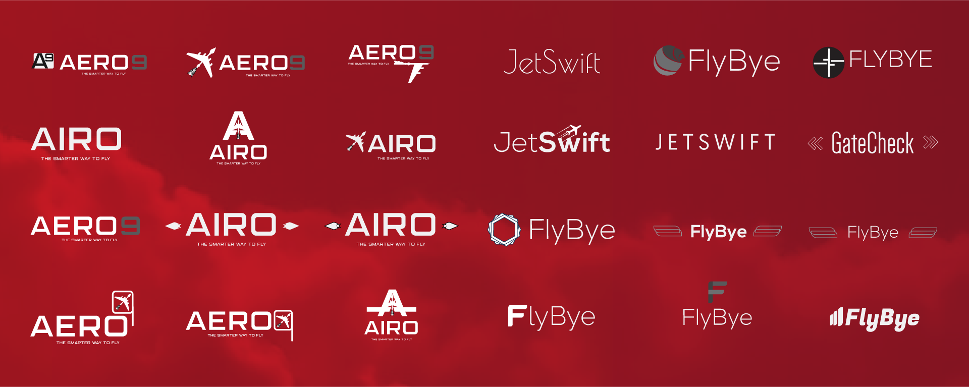
In the beginning, I wanted to create something unique like Aero, but after doing some research online, I found out that another travel company took the name already. So from there, I was trying to think of different messages that this company wanted to portray. I wrote down a few ideas and ultimately came up with the idea flybye, because it's an airport app and I wanted the user to fly by the airport with ease. After coming up with the name, I got inspired by the tail of the airplane to come up with the unique branding to complement the company name. From there it was choosing colors. In the beginning, I chose different shades of blue, because I wanted to create something calming especially because most users feel rushed at the airport. After the constant effort to try to make different shades of blue, it didn't work. I showed my users and the feedback I received was it looked like either Delta Airlines or American Airlines. So from there, I did color theory research into different air transportation and figured out that red was one of the most distinguished colors in the sky.

Information Architecture
Wireframes
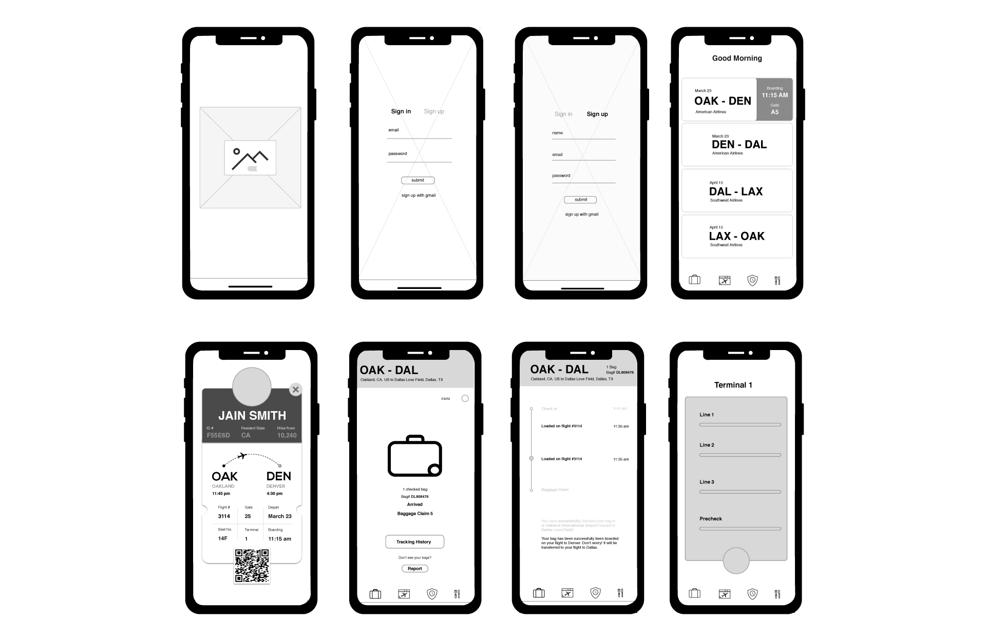
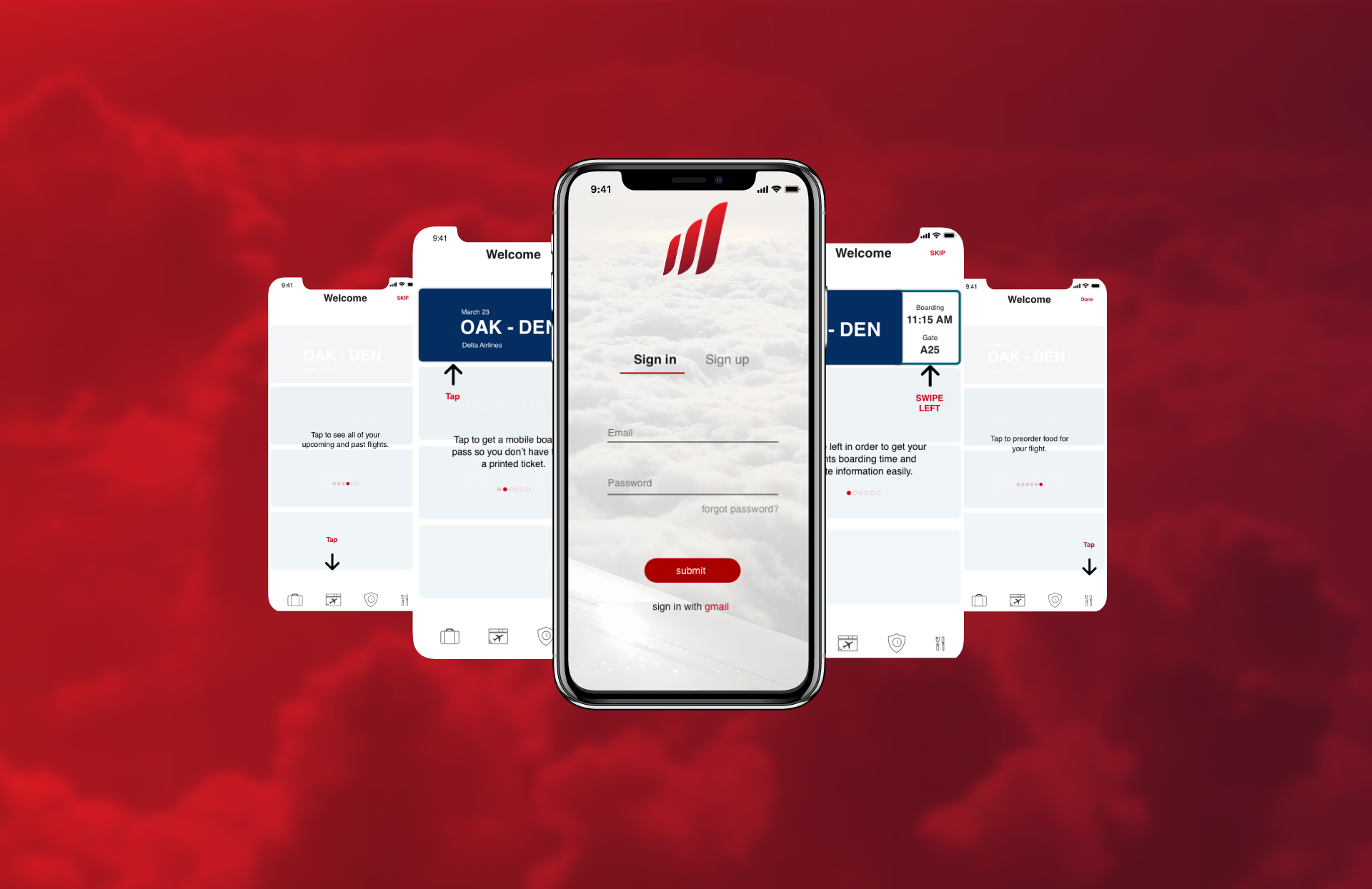
When doing my research on other mobile airport applications, especially on mobile boarding passes, I found out that users had a hard time looking through their boarding passes while rushing. So I wanted to create a simple way just for the information that they need. So I designed my app to allow users to simply swipe their flight tab just to show their boarding time and gate information. After user testing, I found it was hard for users to swipe to see only their gate information and boarding time only. So after testing different users, I decided to create an onboarding system to show users how to use the app.
Onboarding
Since users were having a tough time with the swiping gesture, I had to create the onboarding system that teaches the users not just how to just get their boarding time and gate information, but how to preorder food, how to check the security line, and see their upcoming flights.
Baggage Tracker
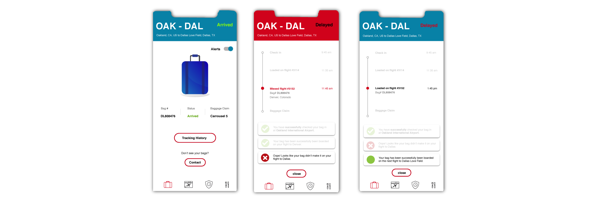
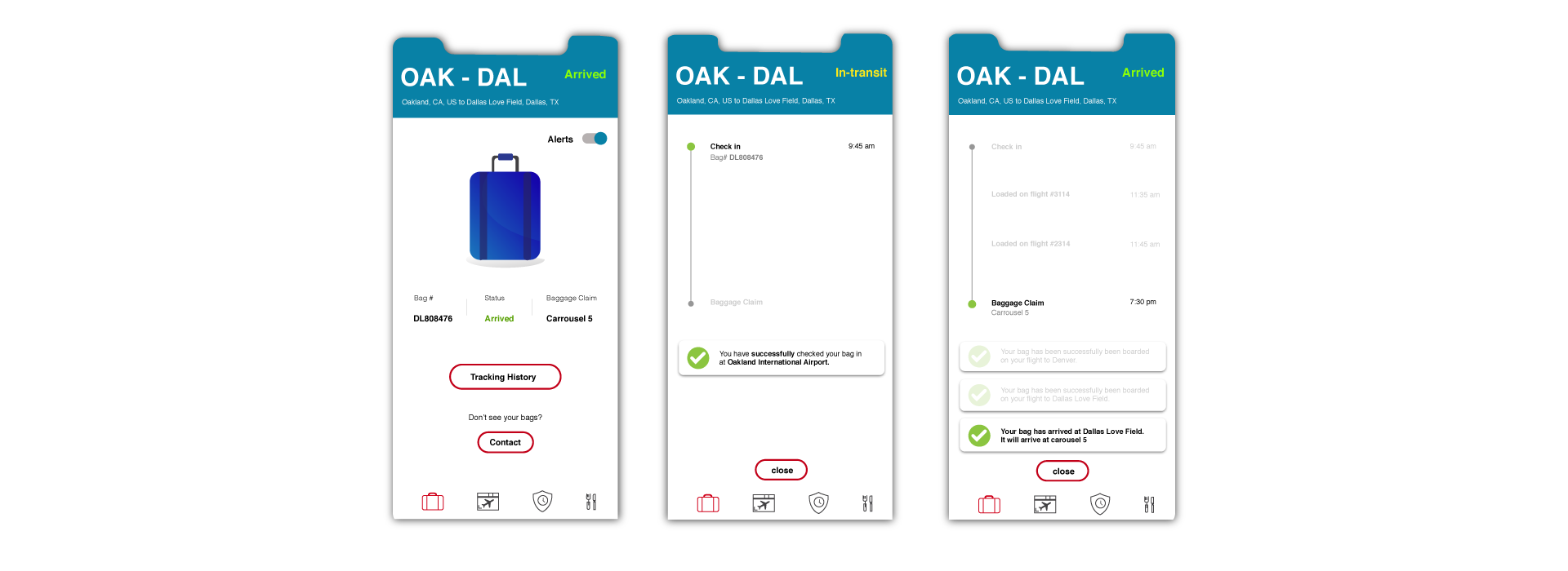
Since people wanted a real time baggage tracker, I decided to create a tracking system that allows people to know exactly where their bag is. Once users check their bags, they’re notified that their checked bag has made it on the correct flight. From check in to landing at their final destination, they user will always know where their bag is and when they expect to get their bag.
Successful
Unsuccessful
