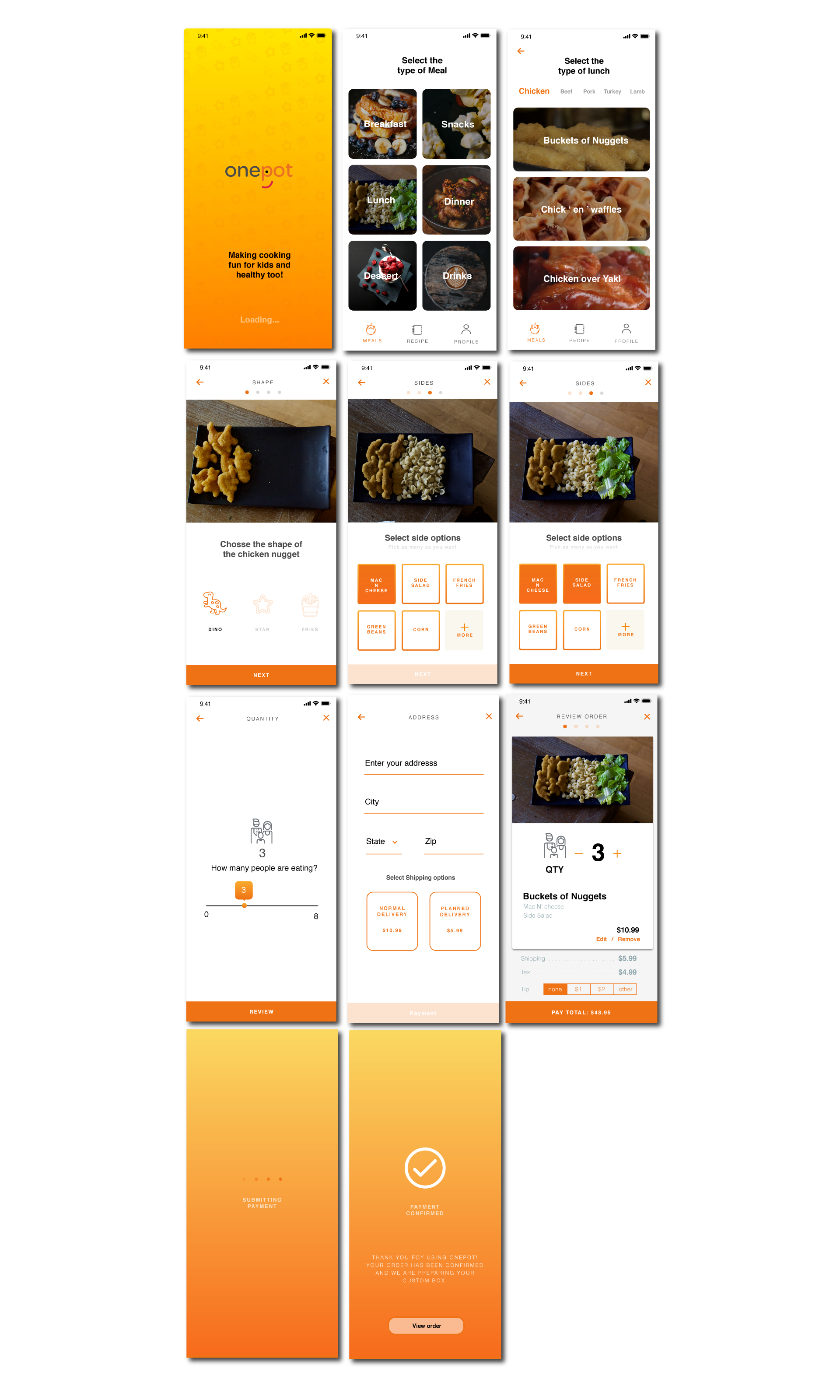
About
Onepot is about getting more kids in the kitchen cooking with parents. Parents are either too tired to cook or they cook the same thing over and over again because their kids are too picky to try something new.
My Role
My role was to research common pain points that people were having while cooking. From that research, I synthesized and grouped all my findings to find and solve the most common problems people were having. After the research, I conceptulized, developed and tested the branding, wireframes, lo-fidelity/high-fidelity mockups and prototypes.
Mission Statement
When I was first assigned this project, I wanted to help cut food waste. My original idea was to create a collective way to buy food. But after research, I found out that parents were less likely to buy a food subscription service like Blueaparon or Sun Basket because their kids were too picky. From my research, I decided to create an app that would allow parents to cut down on grocery shopping and to help teach their children to cook.
The Problem
When parents go grocery shopping, a majority of them throw away at least some of their food. Parents usually are too tired from work, so many parents cook enough for the week in one meal. When unexpected events happen, people end up wasting their food.
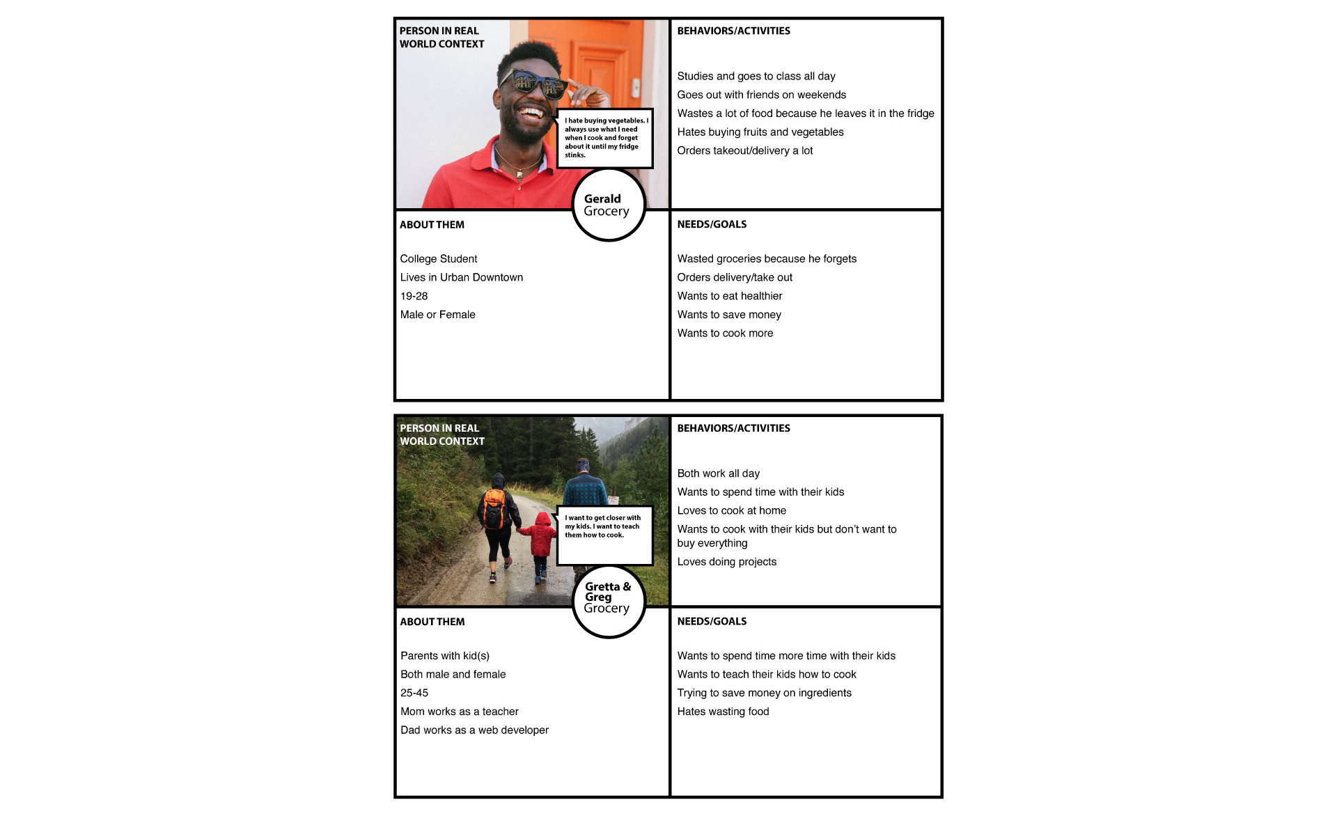
The Persona
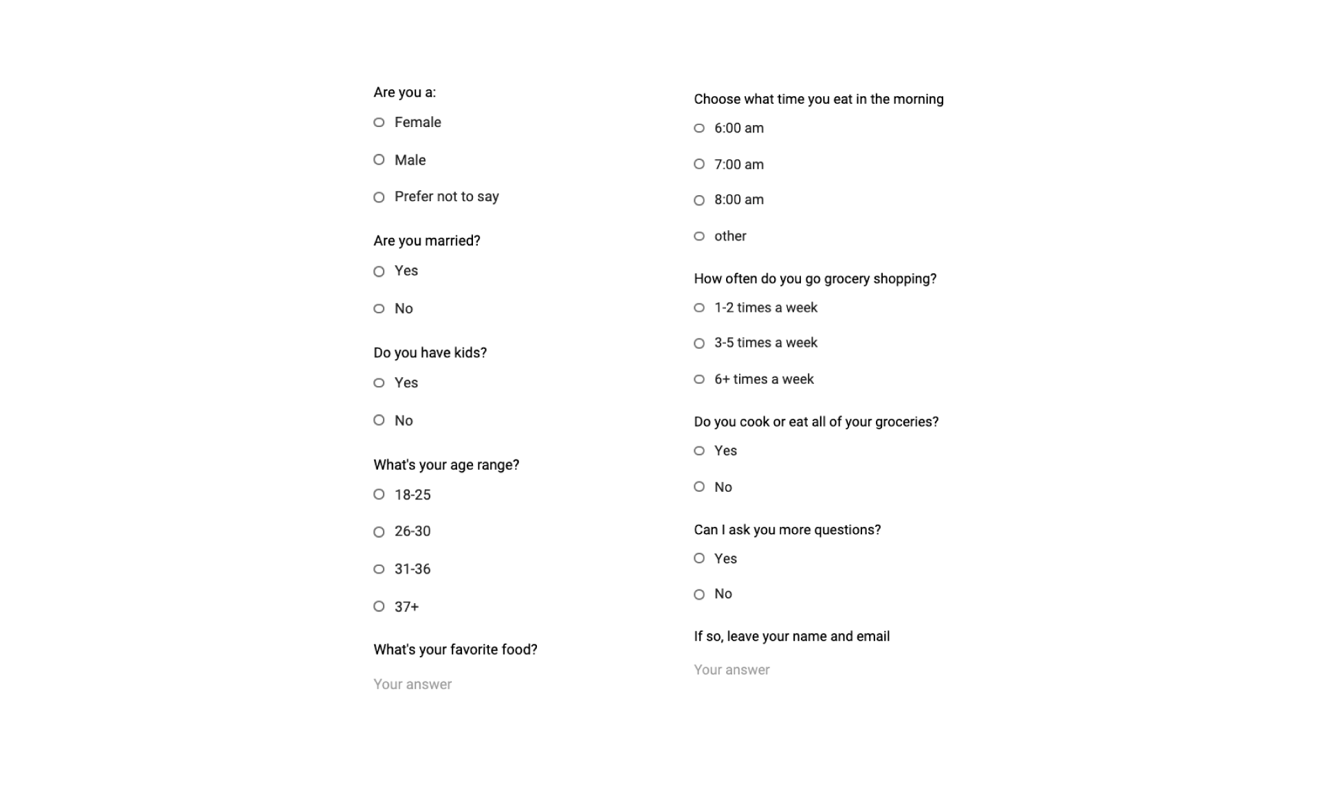
The questionnaire


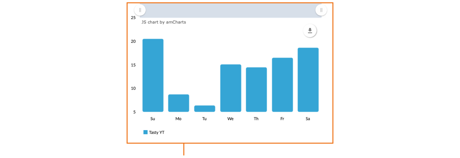
After looking at analytics on Buzzfeed Tasty videos, a majority of people watch videos on the weekends , rather then weekdays
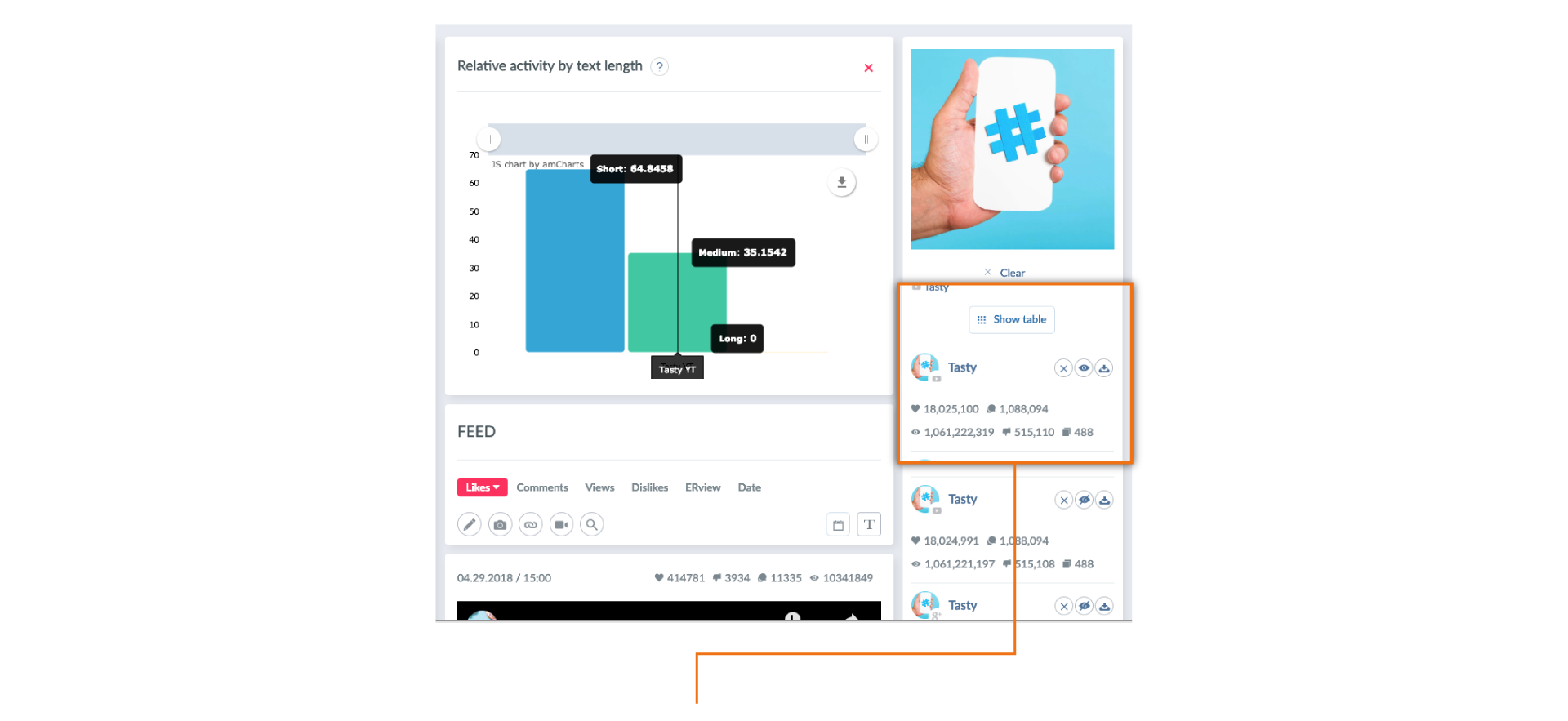
There are 1,061,222,319 people looking up short cooking videos created by Buzzfeed.
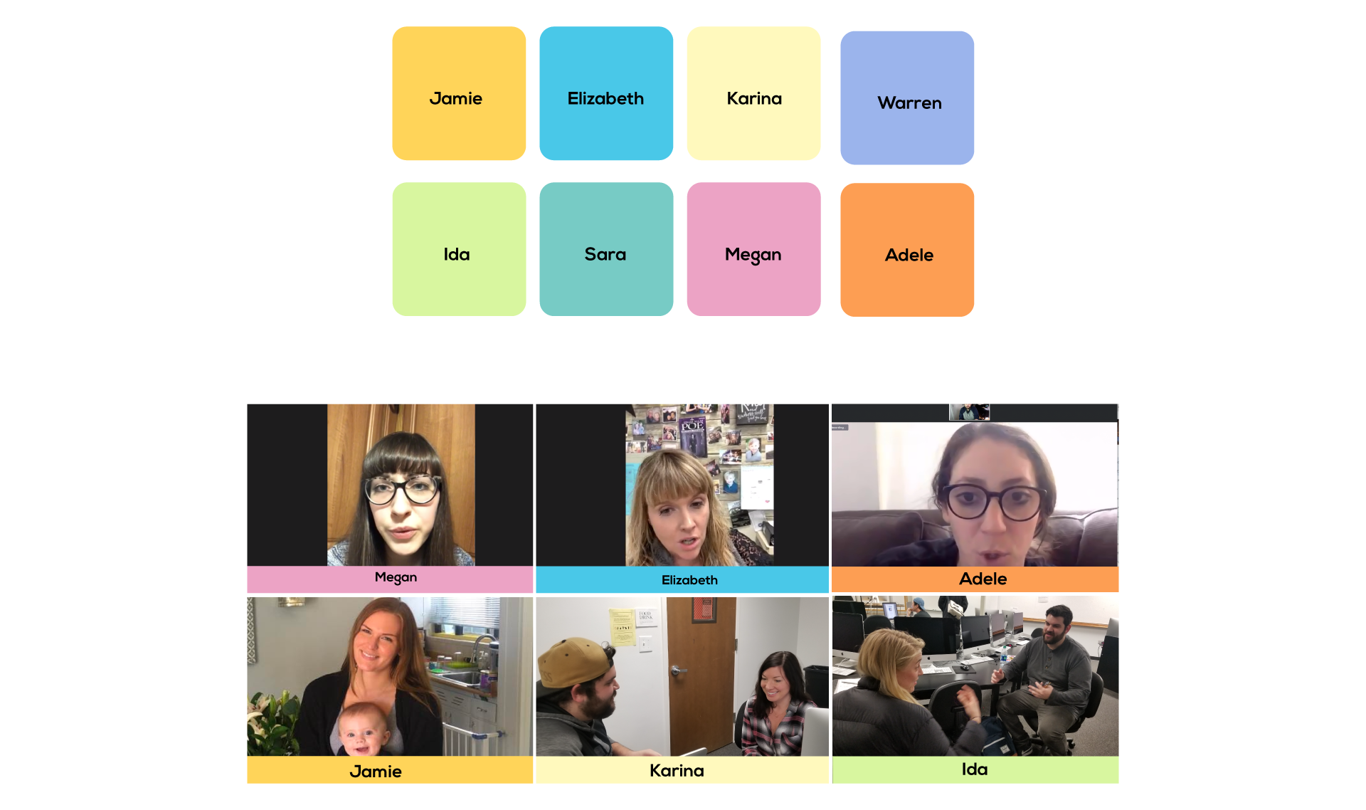
The Interviews
Learnings and Findings
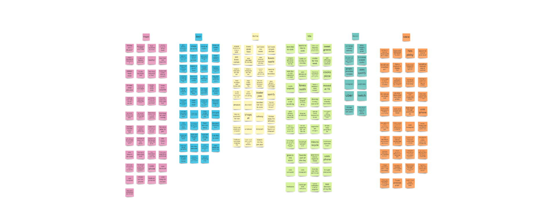
- Parents waste more food rather then students.
- Chefs would never use an app like this because they already have everything planned out.
- Even though parents want to cook with their children, they have little time or they are too tired when they come home from work.
A/B Testing
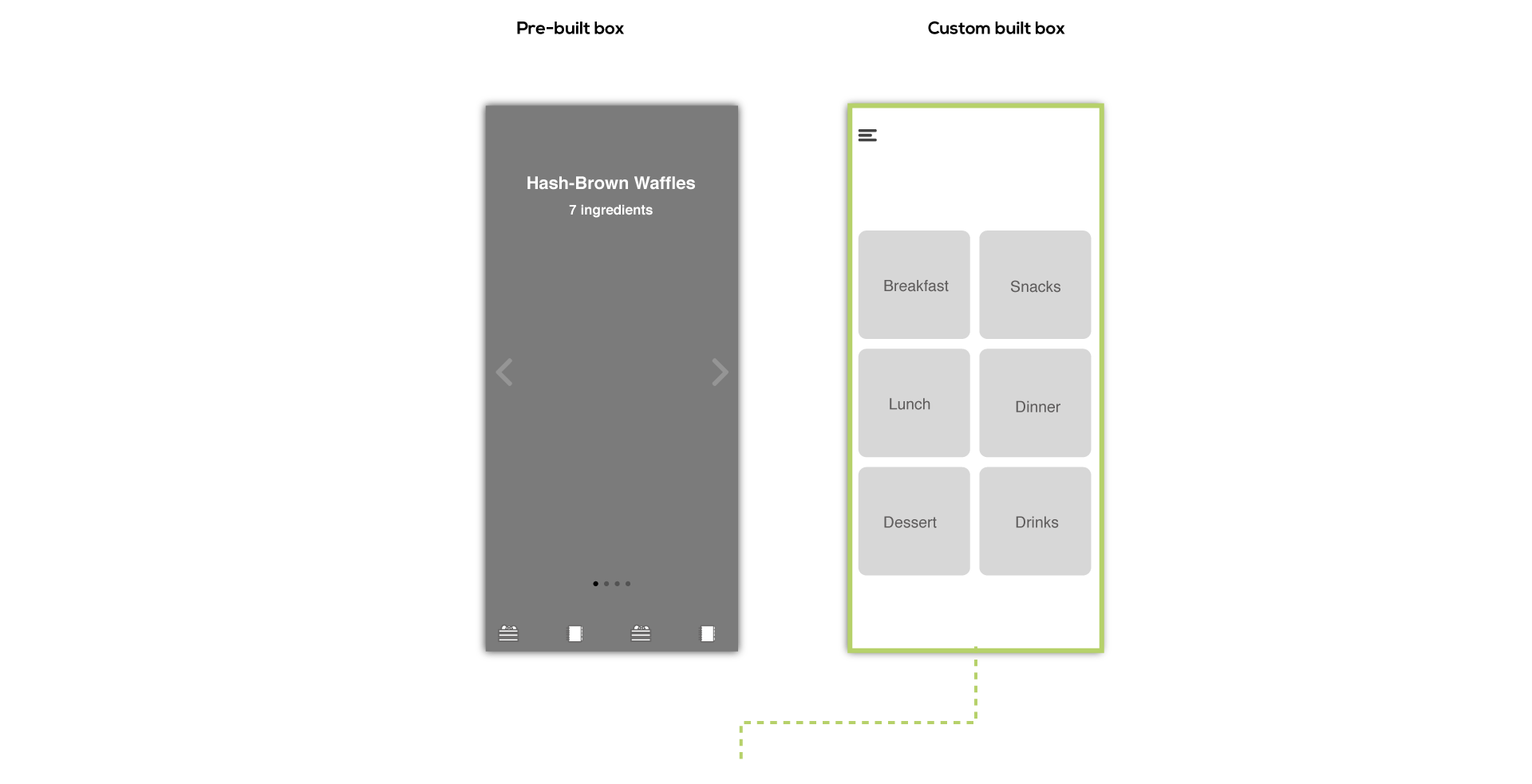
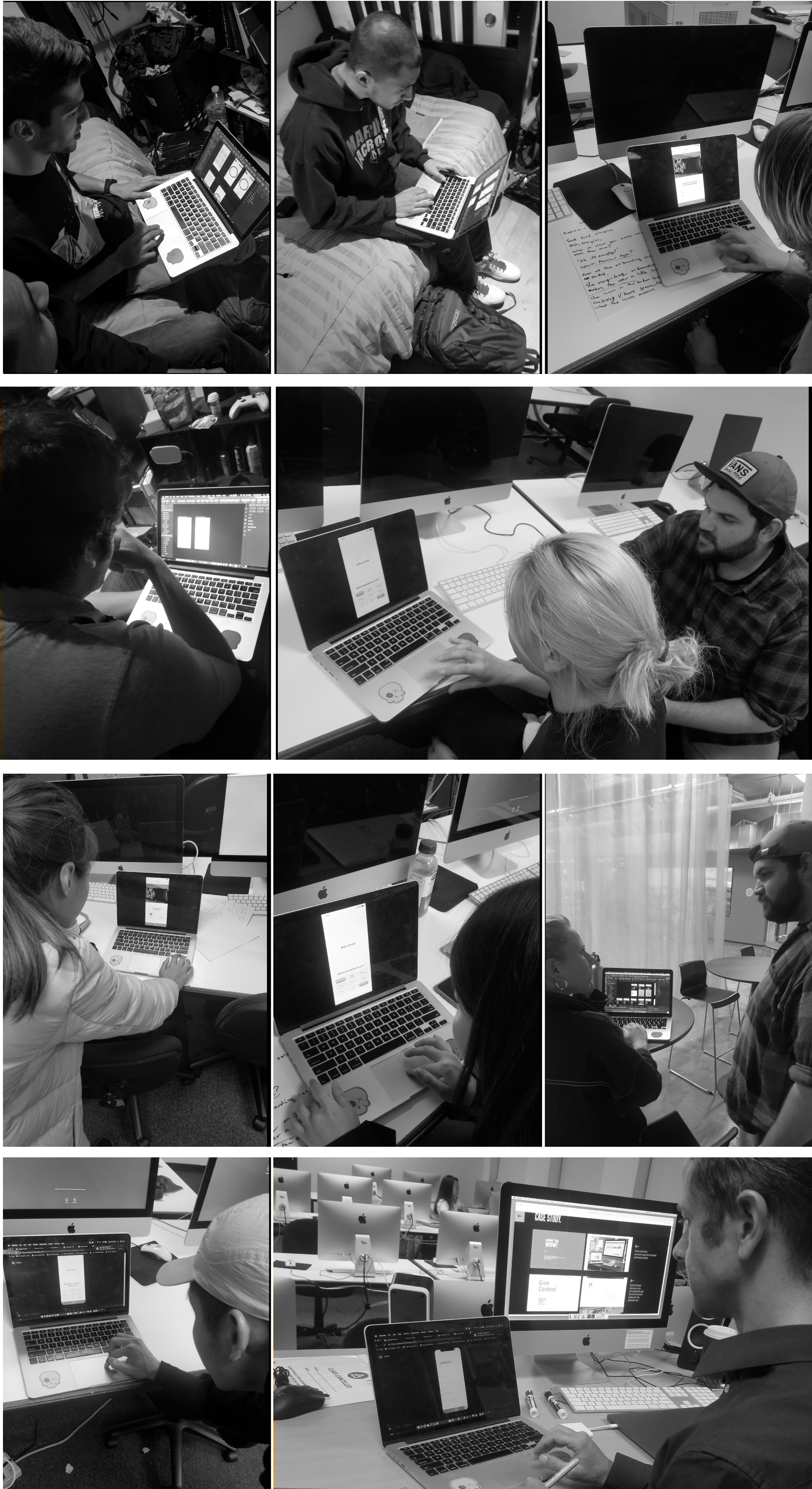
When conducting user testing, I showed users two options, option A and B. Option A was a pre-built box, while option B was a custom, build your own box. I found that people wanted a custom built box but had the options for trending recipes. After showing users both options, I came up with another option for the custom built box.
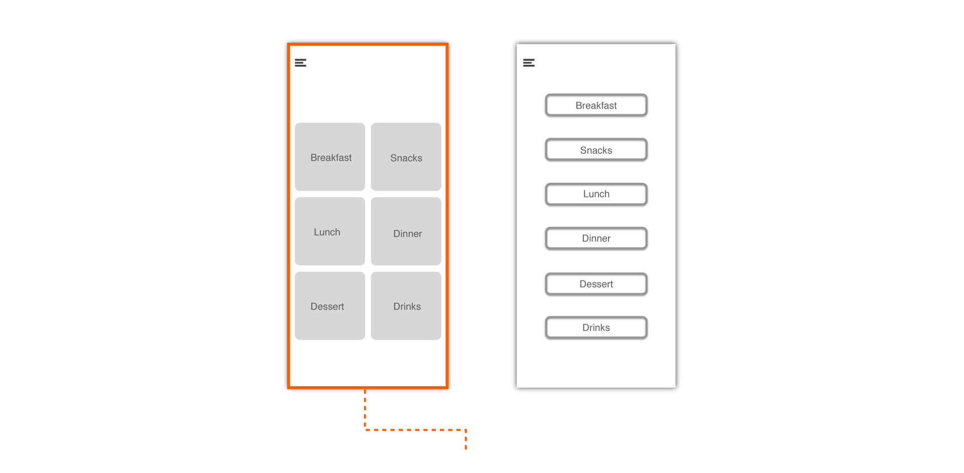
When testing, people felt option a had more of a modern feel while option b had a more retro feel to it.
Wireframes
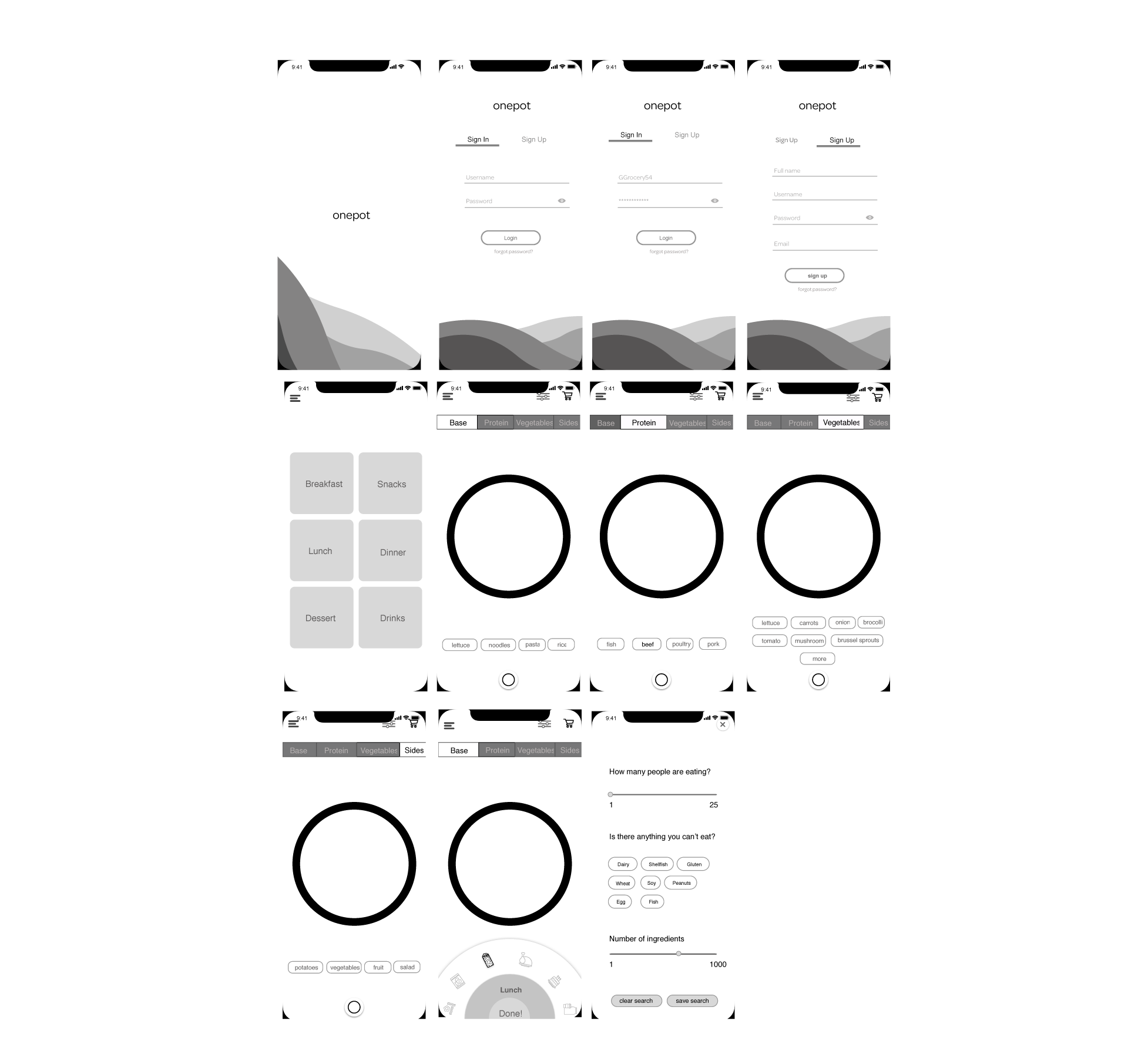
After doing my wireframes, I found people thought the flow of the app was very simple and easy for them to follow. But for some users, they didn't understand what the circle was on the bottom, which allowed them to switch between meals easily, I decided to get rid of it which allowed users to focus just on creating their custom meals.
Final Screens
